Mittwoch, 29. Oktober 2008

Heidi Klum Rose - finished

Heidi Klum Rose, watercolor,
10"x16,5", copyright: Doris Joa
SOLD


Hurrah! The painting of the Heidi Klum Rose is finished.
I really did hurry this afternoon, because I still wanted to do a photo, before it was getting too dark outside. I did soften so many edges, but I still need again a closer look to see if I have maybe forgotten one or two.

The greys in the background at the top are a mix of sap green with winsor violet.
When you compare this photo to the photo in the post before you will notice that I have painted over some leaves, which were too white, it didn't work and my eyes were still wandering there, especially to the leaves on the right side at the bottom.
When I was finished with the painting I did at first a photo and looked to it at the monitor. This helped me to see how distracting the hard edges were. So I used a flat brush and softened them.
Here is a photo of this brush, this works really perfect.


In the next photo I just would like to show how the painting looks before with some hard edges and how it looks after softening them. This may help for the beginners to get a good suggestion.


You see in the left photo how distracting these edges are, here is a close up of the part which shows it much better. I think I should have done the photo then, before I softened the other edges and did think of showing this when the most were already softened. But I think you will get a good suggestion of what I mean.


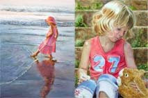
The next Rose is already planned and I hope to start this maybe tomorrow, but for now I will go back to my figurative work, this WIP you can see on my regular blog here.

See you soon!

Montag, 27. Oktober 2008

And the next one ...


I have worked more on this Heidi Klum Rose Painting.
You see I have done a lot of progress and I really love how the painting develops. I only hope that I will also be pleased when it is finished. :)
I have start to add darks to the background. Within all the leaves (there are really many leaves) I think this works the best. The darks have I created with Alizarin Crimson, Phthalo Green, Sap Green, Helio Turquoise, Winsor Violet, Ivory Black (but only mixed together with other colours) and here and there some Indian Yellow.

To integrate the leaves into the background I have at first wet the area, where I wanted to paint the darks around the leave and then I simply moistened my brush with clear water and did wet the edges of the leaves. The result is that the still wet paint of the background runs over the leaves. This avoided hard edges at first and brings the leaves in the background that they are part of it.

I really love the painting - the feeling of a hot summer day. I have only worked with transparent watercolors and have not used any masking fluid. I have painted around the whites.
But I also have to add when you loose some highlights it is always possible to add then maybe a hint of white gouache to save your painting.

See you soon!

Sonntag, 26. Oktober 2008

Next Step of Heidi Klum Rose


I have finally done more progress on this painting. This is the next step.
I am still working at the background with all the leaves and I really like how the painting is developing.

See you soon!

Samstag, 25. Oktober 2008

Heidi Klum Rose - next step


There has not happened very much in this Rose painting yet. I did have a visit from a very dear friend, which I have not seen for several years now and I took all the time for her which was possible. And the other day I was swimming with my kids and we all enjoyed this.
Also I am still working on a figurative painting, which Work in Progress you may have seen on my other blog, so there was only a bit of time for this Rose.

I am very excited that my Step-by-Step-Demonstration is also available now in Russia Language. I was asked if I would allow this so that Russian people can read it and learn from it. I am very pleased that my Demonstration, is helpful and that other artists like to learn from it.
You can see it in Russian here.

I have painted more on the petals, using all the colours, which I mentioned before. But I liked to go to the leaves and wanted to paint some of them, this gives me the feeling, that there is more happening on the white paper and I enjoy this. It also gives me a better feeling how the painting will look like, so I am painting then here and there on the mainsubject and here and there on the leaves.
For the leaves I used aureolin yellow, indian yellow, sap green, phthalo green and helio turquoise. I also used some of the Winsor Violet in the leaves. I like the different colours on the leaves, to have some warm and some cool and some darker and some very light. I love to go forward with this painting and I hope to post very soon better progress.

I was contacted by several people about my new Rosesblog and that they like it and my Demos of how I create my Rose paintings. I hope that my blog is also helpful for YOU and gives some inspiration. Please share it with your friends and link to my blog and when you have a moment, simply leave a comment. I love to hear what you think.

See you soon!

Mittwoch, 22. Oktober 2008

New Rose Painting - Heidi Klum Rose


As I promised yesterday in my post I have started today with a new painting of the Heidi Klum Rose.
It needed some time with finding the right composition. This time I will have a lot of sunshine in the painting, especially later on the leaves and in the background.
Hopefully all works so how I want to have it. I think it is always an adventure to start a new painting and later to see the result. Often I am pleased, often I am stunned and often I am disappointed that it turned not so as I wanted to have it. And then I think ... the next painting will be perfect ... the next one. :)

I have done two photos. I was not able to paint very much and I needed to do a photo before it was too dark outside.
In the first one you will see the drawing, the photo is not the best. Sorry for that.
The painting will be around 10"x14" in high format.
I paint on coldpressed 140 Lb Paper from Lanaquarelle (the same quality as Arches) and I paint directly on the block without stretching it. It works perfect.

The Heidi Klum Rose is a very pink/violet Rose. The petals in shadow are having a dark violet/blue colour.
I am using the following colours:
Permanent Rose and Alizarin Crimson for the very warm areas,
Purple Magenta is the "local" colour, which I also add to the warm and to the cool areas
Winsor Violet and a Mix of Purple Magenta for the cool areas and I add Helio Turqouise to this mix, when I want to have it darker. In the areas where are the really darks I am using a mix of Alizarin Crimson/a bit of Purple Magenta/some Winsor Violet and a bit of Sap Green, because these areas are not so cool, so I leave out the Helio Turquoise there.

I must add here, that I am playing with the colours and when the colour is dry I often see, that it looks not completely so as I wanted to have it, so I may go over this area again and then add another colour from the colours above. I also do not always mix on the palette. ON some petals I am now simply wet the area and then drop the colours in which I want to have there and let them mix on the paper.

The leaves will bath in sunshine later. There are leaves which are looking more green and some are looking really blue and for this green/blue I will use the Helio Turquoise. I love this Colour and since I know that I will use it on the leaves I am using it also in the Rose. I simply thought I would try it out.

It also can happen that something doesn't work, or the colours do look terrible, I then always start over to try to make it better. Don't be afraid to play with your colours - I have figured out that often in the beginning it looks so lala and when you go on and see how the flower develops you will be very pleased. When not - start over and try it different again to get the result which you want. I cannot count how often I have started over and over with paintings, if this were flowers, Roses or figurative work. But since I am not afraid about this it makes it much easier and more relaxing to work on a piece and to try things out.

I hope to show soon another step of the Rose how it develops. Hope you find my infos helpful.

See you soon!

Dienstag, 21. Oktober 2008

Lions Rose - finished

Lions Rose, watercolor,
around 7,3"x11,5", painted on 95 Lb coldpressed Arches paper


Oh I just realized that there are almost 4 days over since I have done my last post here.
I am sorry about that.
I have painted more on this Lion Rose and I also have finished it. But I have done photos of the earlier stages.

I told you already which colours I used in the bloom and I have go on with these colours. I darkened them where neccessary until I was happy with the look.
I then started with the leaves.
I have paint them in sections to describe them well and not to have only a soft look on them.
I used underpaintings of indian yellow for the warm areas and Helio Turquoise on the cool sides.
Over these underwashes I used Sap Green, a mix of Helio Turquiose and Sap Green, added some translucent orange, added sometimes a bit of Alizarin Crimson and a bit of Phthalo green.
I used them there where I wanted to have these colours. For more warm I added the Translucent Orange, for more dark I added alizarin crimson with sap green and/or phthalo green, for more cool dark sides I added more of the Helio Turquoise to the Sap green.
It is always a good way to use the same colours which are used in the subject. The only change I made was that I used the Helio Turquoise on the leaves instead of the Phthalo blue which I used in the bloom.

At first I wanted to stay with a white background but I did not like it. The Rose is such a light colour and it was not good to see on the white background, so I added a background.
I wanted the background around the rose darker and lighter where the leaves are, because otherwise the leaves would have seen not very good.
In the background I wet the areas and then added here and there Sap Green and/or Alizarin Crimson and/or Translucent Orange and/or Helio Turqouise and/or Phthalo Green and/or also a bit of Ivory Black.
Behind the leaves I used some Translucent Orange and Alizarin Crimson but then added some Sap Green to dissatisfied the colours a bit.
It is really bad weather outside to take a very good photo, but I think this comes near to the Original painting. I also was thinking about adding a really dark background behind the bloom but was not sure how it would have looked with the lighter background at the bottom, so I stay with it as it is now. I am pleased about the result. I think the Rose looks elegant and the background fits perfect to it.

Tomorrow I plan to start a new Rose and this one will be very different in composition and colour - a pink/deep purple Rose. The Heidi Klum Rose. I once painted this Rose in oil, but I think with watercolors it will be very different.

See you soon!

Freitag, 17. Oktober 2008

Lions Rose


I did start yesterday with a new Rose painting. The Name of the Rose is "Lions Rose" and grows - again - in my own garden. This Rose looks absolutely beautiful, the petals are creamy with a hint of pink.
The composition looks very interesting, the full bloom is at the top of the high format and there will come the stem with dark green leaves. In the close up you can see the colours of the bloom better. There has not happened very much yet.
When I start a Rose painting (or any other painting) I always need the first time to think which colours would be the best and I apply them very carefully to see if this is what I want. When I like it I then add more and darker layers.
For the creamy white I have decided to do a mix of Indian Yellow and Translucent Orange (a very light mix), because it is not only yellow and it is not only orange. And the Yellow and Orange works perfect for me. For the hint of pink I am using a very ligth wash of Alizarin Crimson.
For the darker areas (where the petals are in shadow) I use a mix of Alizarin Crimson and Phthalo Blue and add here and there a bit of orange to the mix and/or also a bit of Sap Green, because the colours of the leaves will also be reflected in the petals.
For the warm orange/red areas in the petals in shadow I have applied at first some Translucent Orange and then some of Alizarin Crimson. Maybe I will later reduce the warmth of the colour there and add a bit of Phthalo Blue.

See you soon!

Mittwoch, 15. Oktober 2008

Orange Rose - October Challenge Painting


In one of my previous Posts I was talking about a Painting Challenge.
The October Challenge was to paint an orange botancial painting. I knew immediately that I would paint an Orange Rose and here is the painting.
It is painted on 95 Lb coldpressed Arches watercolor paper and size is around 10"x12".
You can buy it directly from my Etsy-shop, if you are interested in this painting.

Please visit the Artcolony.blog to see what the other artists have done. We are a group of very nice ladies from UK, Canada, USA and Germany (me!). It is great to know all these ladies, although it is through Internet. But who knows maybe one day we will meet each other........

Go to http://artcolony.blogspot.com and view all the October Challenge Paintings there. You will love them.

Montag, 13. Oktober 2008

Orange Rose


Rose Bonita Renaissance, size: 5" x 7"
copyright: Doris Joa

This is my newest Rose painting. This Rose is named: Rose Bonita Renaissance. I have some Renaissance Roses in my garden, Clair Renaissance, Amelita Renaissance and Bonita Renaissance. All three are so beautiful and so different in the colours.

Bonita usually is not so orange, but I wanted to paint it so glowing as the Rose was hit by the sun.
For the Oranges I used an underwash of Indian Yellow and then added Translucent Orange.
For the darker colours I added at first Alizarin Crimson to the Orange, but I did not like this mix, because Alizarin Crimson is a cool red and Translucent Orange is warm, very warm and I did not like the effect. So I added instead Scarlet Lake, a warm Red and was very pleased with the result. Only for the cool areas I used the Alizarin. The leaves are painted with Helio Turquoise for the cool blue hues, and for the warm greens I simply mixed this Turquoise with Aureolin.

The dark background was painted with Indian Yellow, Alizarin Crimson, Phthalo Green and Phthalo Blue. I have not done at first an underwash of Yellow. I simply added the colours and let them mix on the wet paper. But to get this really darkness I needed to do some layers.

When I did my last order at my supplier I did a mistake. Although I ordered Arches coldpressed paper, I ordered the wrong weight, instead of 140 Lb I have now 95 Lb. But I must say the only difference is that the paper is thinner. It was very beautiful to paint on this paper and makes absolutely no difference in the quality of the artwork. The colours are the same glowing as on the thicker paper. I have not stretched it, I painted this Rose on the blog. Only when I removed the paper from the blog then I saw that I worked on a thinner paper.

This Rose and the other two Roses are up for auction on ebay.
Click here for purchase information.

I am painting on another Orange Rose and I hope it will be very soon finished.

One side note: On my regular blog I have posted today some Gladiolas and a Pink Hibiscus, I think they are worth a look (Purchase Infos for them are extra). Thank you.

See you soon!

Sonntag, 12. Oktober 2008

Rosebud

"Rosebud", 4"x7", watercolor

With looking through my reference photos I found this beautiful bud and I had to paint it. Usually I paint full roses in bloom but I think that often buds are so beautiful, especially when there are different colours. When we paint roses often the buds own at the second place and the rose in full bloom is the center of interest, so I wanted to have now the bud as the star of a painting.

The Bud is from the Rose "Sangerhauser Jubiläumsrose". I used the colours: Indian Yellow, Permanent Rose, Alizarin Crimson, Sap Green and Helio Turquoise. Oh and Aureolin (the cool yellow).
In one of my previous posts I mentioned that I tend often to overwork areas, especially in the leaves. When having a white background then this is okay to go darker but when adding a dark background the effect is then gone. So this time I only applied a tiny little wash of Helio Turquoise on the leaves and then I added the background. This was a good decision for me!
When the background was added then I added a bit more of a mix of Aureolin and Helio Turquoise, so that it just was enough, because I wanted to have the leaves very light against the dark background.
The dark background was painted at first with a Indian Yellow underwash, then I used a mix of Phthalo Green, Alizarin Crimson and Phthalo Blue to get the darks.
For dark backgrounds I like the coldpressed paper much better, for the smooth look of the Rose I like the hotpressed paper better.

Freitag, 10. Oktober 2008

Yellow or Orange Rose?


Yesterday I was already working on a new composition for a yellow Rose painting and wanted to start with it. But now I will do at first another colour, it will be an orange Rose.
I belong to an Artgroup and we have decided to do a group-project. The project is a botancial work in orange. At first I was thinking about maybe an orange Daylily, an orange Hibiscus but then I have decided to do an orange Rose.
So this morning I am sitting here with my beautiful cup filled with coffee and I am searching through all my Ref.pics. I just found something what grabbed me and now I will go and work on an interesting composition. When I have figured this out I will then decide about the size. I was thinking about 5x7 inch or maybe also 8x10 inch. Will see.
I hope to work today on it, but the weather is so fine and my kids would love to do anything with me outside. So maybe I will be able to show something tomorrow and not today.
But I already can tell you it is the Rose Pat Austin, one of David Austin's Roses and I will paint this in watercolor.

See you soon!

Donnerstag, 9. Oktober 2008

Pink Rose Painting finished


I am so excited. My first Rose painting for this blog is finished.
It is only painted with transparent watercolors and I used all the colours which I mentioned in the previous post.
At first I was worried a bit about the composition and I had to cut some of the white area on the right side, it did not look good. But now as it is I really love it to have this painting in this way.
It worked also absolutely great on the unstretched hotpressed paper - it did not buckle in any way.
I am off to start a new Rose painting. It will be a yellow Rose and I have already worked on the composition.
I have hundreds of reference photos or better thousands and I could not get enough to view this Roses. But when I look through them I must get the "Kick" and then I immediately know which one I want to paint. Otherwise I am getting bored while painting and this is never good.

I do not have a Title for this Rose painting yet. I was thinking about giving names to the Roses, not the real Roses names, because I do not know all the names. But how would it be to have girls names for the Roses, like "Monika", "Irina", Julie or so. Hmmm ... I must think about it. Maybe I will get another idea.

See you soon!

Mittwoch, 8. Oktober 2008

Next step on the Pink Rose painting


I have worked further on this Pink Rose Watercolor painting. More leaves are painted and the main rose is also finished. I really love what I have done yet and I am very pleased about this Watercolor painting.
It also makes a lot of fun to paint on the unstretched paper in the blog. I never have done this with hotpressed paper before and a fellow artist told me that she always did this and never got any buckles, so I needed to make things easier for me, instead of wasting my time with wetting, stretching, dryingtime etc.
I painted with the colours, which I mentioned before on the leaves as on the Rose.
Since this painting will have a white background, then it will be a botanical Rose painting, I hope to finish it tomorrow. Hope you like what you see yet.

See you soon!

Dienstag, 7. Oktober 2008

More Colours on my Pink Rose Watercolor Painting


I have started with painting on the rose.
In the first photo you can see that I have already some yellow underwashes.
I used Indian Yellow on the Rose - where I think where the warm areas are.
I then used also Indian Yellow on some of the leaves, but I also used Aureolin (a cool yellow) on other leaves.

In my previous post I made a mistake. I do not use Transparent Rose, the right name of the colour from Winsor and Newton is Permanent Rose. I am sorry for this mistake.

Did I already tell you that this rose composition is done from several photos which I did about this Pink Rose? Although I worked a bit on photoshop for the composition, the rest was created when I did the drawing. So I really have no real idea how this painting will look like when it is finished.
This is always an interesting part to see how the painting will develops.
So while painting I think it will help when I add more and more colours on different parts and not only concentrate on maybe the rose.

In the second photo you will see that I have add some colours. For the warm areas on the Rose (where also the yellow underwash is) I added a mix of Alizarin Crimson and Permanent Rose. For the neutral tones I used only the Permanent Rose and for the very cool areas I use the Permanent Rose mixed with Phthalo Blue.
On the leaves I am using yellow as mentioned above and also Sap Green (from Daniel Smith). I also added Alizarin Crimson there and of course Phthalo Blue is also used. I have a wonderful Turqoise Colour in my box (Helio turquoise from Schmincke), which is a beautiful colour, so maybe I will work with this colour too on cooler areas. I love Turquoise colours.

I am so excited about this Rose painting, but I must be careful. I tend to overwork often some areas and then it can happen that I am loosing the whites so I always must stop myself. LOL
Also it is great to drop in the colours instead of doing brushworks. I mean wet the area and then drop the colour in and it will flow naturally.
I will go on and adding more colours now.

See you soon
and Thank you for stopping by.

Montag, 6. Oktober 2008

New Rose painting started


Today I have done the drawing for a new Rose painting.
It is a Pink Rose with a lot of leaves and three buds and a tiny mini bud.
I will paint this Rose on 140 Lb hotpressed Watercolor Paper. Usually I always stretch my paper, but I want to try new things. So this time I will paint directly on the blog without stretching and see how it works. Will it make a difference when the paper is untouched and was not yet in water? Hmmm ... I am really curious.

I will do this Rose painting with a white background. I have done a photo of the drawing, so it will give a good suggestion how it looks. But it also can be that I will change some of the leaves during the paint process, add some more, change the angle, form and so on.

For my pinks I will use Transparent Rose from W&N, Alizarin Crimson from Schmincke, some Indian Yellow and Phthalo Blue (both are also from Schmincke). Of course I will not forget to add some green of the leaves on the flowerpetals, to get colourharmony. As you know each subject is reflected by things arround it, so I will also add some pinks on the leaves later.
I will make some photos of the painting process. I am sorry when the photo of the drawing is not better, I just made light pencilstrokes, which I also will erase before adding the colours. I do not like to see later the pencildrawing.
I will start at first on the big mainflower and then I also will start with working on the leaves.

See you soon!

Sonntag, 5. Oktober 2008

Welcome to my new blog

This Blog is something what I wanted to do for a long time now.
I am a Roselover, I love to look at them, to smell them and I love to have them printed on special things, like my coffeecup, in magazines, journals and so on.
But the most what I love about Roses is that I love to PAINT them.

I am a self-taught watercolor and oil artist and I love to create Rose paintings. I wanted to concentrate for a long time on special Rose paintings, interesting compositions, bold colours, but I was sometimes so distracted from other things. But now I finally want to give this a go.
This blog is about Roses, but it is more about painting them.
I want to paint them in watercolor and/or oil in a realistic style. I also would like to do Step-by-Step-Paintings, so that interested artists or also Roselovers find some inspiration in them.

Please note: English is only my second language and here I am mostly selftaught, so please be kind with me, when my grammer is not perfect.
 

.